
April 2020 update: Click HERE to read my review of the Schuyler Treveris including comparison photos of the Allan 43 and Treveris.
Occasionally you will meet people in life who leave you with the impression that they care deeply about their work. Minor details matter to them, and these details are apparent in their works, often to a degree not found in the products offered by their competitors. That isn’t to say their competitors aren’t good at what they do. Quite the opposite actually. The fact their art triumphs in contrast to strong offerings by their competitors goes to show how strong the industry is at the moment, and the exceptional nature of their product.
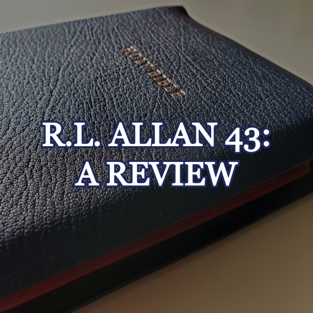
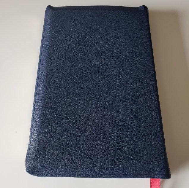
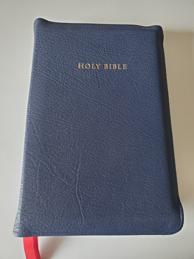
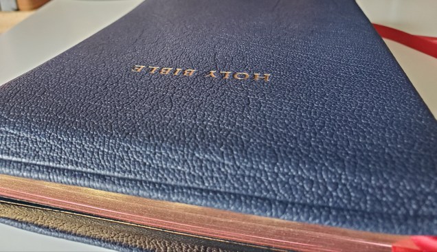
The R.L. Allan 43 is case in point. It’s a work of art. A regal offering in all regards. A book fit to be owned and read by the Queen. If the Earth were threatened with certain immediate destruction and humanity was forced to leave to space, with only a couple possessions in hand, the 43 would travel with me to the cosmos.
I’ve been away from the premium bible market for around 6-7 years. Having stepped away I was pleasantly surprised with what I found when I returned. Notably, the Premier Collection by Thomas Nelson with substantial strides in quality across the board. I remember a time when one could roll a cigarette with the ultra thin and seemingly low quality paper found in some of their older editions. Crossway publishers have continued to introduce new and quality editions of the ESV. Schuyler has released some phenomenal and innovating books that are widely regarded as some of the best in the industry. The HCSB is apparently now the CSB, and Schuyler reportedly plans to publish ultra premium editions of this excellent translation. Not everything has changed though. Christians are still trying to peddle $200 books on eBay for upwards of $1000. Oh human nature, will you ever change?
I remember a time when R.L. Allan was publishing ESV editions using Chinese-sourced Collins Anglicized text blocks. The premium bible community spent many of hour discussing the “ghosting”present in these editions. Will Allan listen and put out an ESV with better paper? Everyone knew it wasn’t the Chinese printing that resulted in the bleed through that plagued these early editions. It was someone’s decision to select a certain type of paper. Perhaps someone who didn’t read the ESV?
But then Allan announced they were going a different direction with the ESV. Sourcing paper and printing from elsewhere. They listened to the customer, and innovated. They gave their customers a product with an interior as magnificent as the exterior.
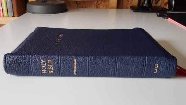
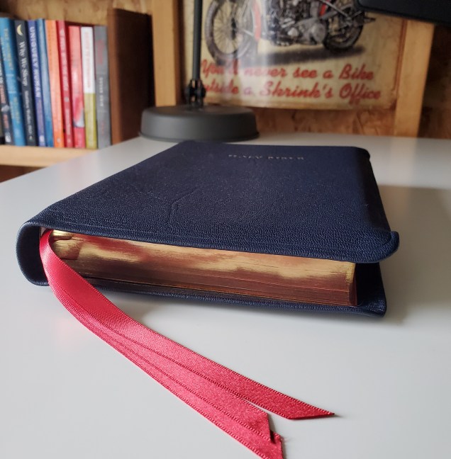
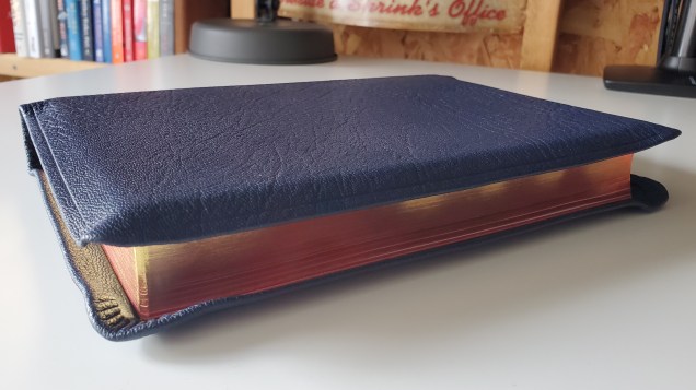
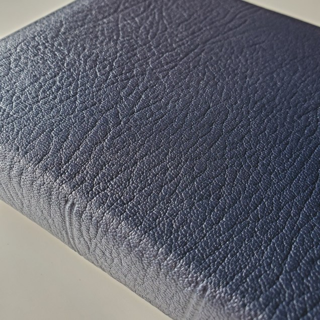
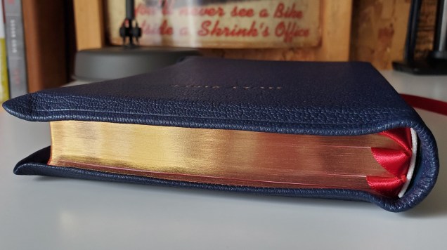
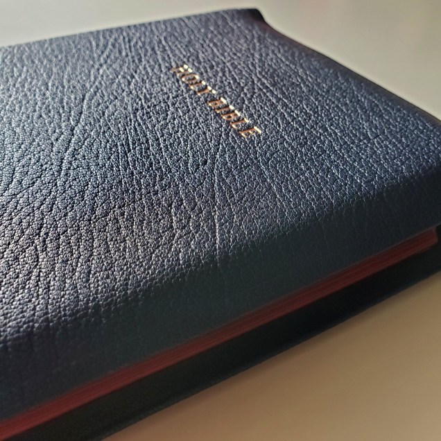
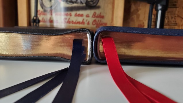
Meanwhile, everyone knew what R.L. Allan was capable of all along because they had been publishing the distinguished R.L. Allan 53 Longprimer for years. The 53 has long been considered to be an example of the pinnacle of book binding. Soft and flexible highland goatskin with full yapp. Impeccable red under gold art gilt edges that when closed, shine like the gold pulled out of the ground in the Klondike. Three long ribbons, that for years seemed both wider and longer than any ribbons present on other premium books.
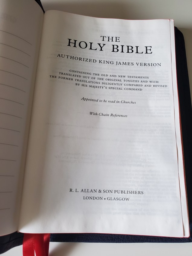
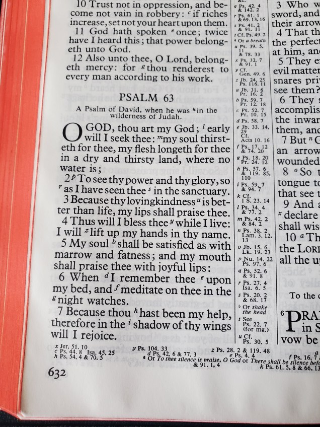
Inside you found a lovely copy of the KJV text printed on quality paper with minimal bleed through. Truly deserving of the stamp of royal decree by Her Majesty Queen Elizabeth.
In early 2020 I visited the Allan website, bibles-direct.co.uk to see if the 53 was still available for purchase. Sure enough, no 53’s were found. However, a listing was present for a 43. So I clicked on it and found something that I always wanted. A book just like the 53, but with slightly smaller dimensions. I googled searching for information on the 43 and found a few videos on Youtube along with listings on evangelicalbible.com and Bibles-Direct. I didn’t find any posts packed full of pictures. Please consider this post my contribution to the 43 discussion.
What I did find however was an article called “Slimming down” written by a Mr. and Mrs. Metcalfe. The Metcalfe’s provide the inspiration for the R.L. Allan 43 in this article:
But what is striking is the difference between the Longprimer then and now – the spine width is thinner, the yapp is tiny compared to the most recent 52, let alone the full yapp 53 and 63 editions, the ribbons are narrower…
We didn’t want to go back to the past – but we did think there might be room for something that recognised the charms of a slimmer, neater package
The Metcalfe’s continue by explaining:
That is the inspiration behind the latest addition to the Longprimer family, a Bible we are calling the ’43′ – still bound in uniquely grained Highland goatskin, still leather-lined and decorated with art gilt page edges, still with three wide ribbons – everything that makes an Allan Bible what it is today – and yet just that little bit easier to hold in the hand. So we have taken a quarter off the spine width just by printing on a lighter 28gsm paper – though it is barely less opaque than the 36gsm paper in the usual Longprimer edition – and given the Bible a generous semi-yapp that in fact still allows the leather edges to meet over the book block, but just makes the Bible that bit easier to carry
They took what they already had, which is great, and modified it to be 1/4″ thinner in the spine by switching to 28 gsm paper. I would not consider this book to be a thin line edition by any means. It is a slightly thinner version of the 53.
With the same highland goatskin found in the 53:
Look at the grain of the goatskin in this copy, superb!
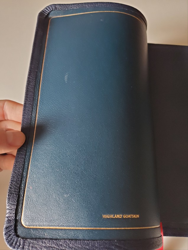
The same calfskin liner, with gold perimeter:
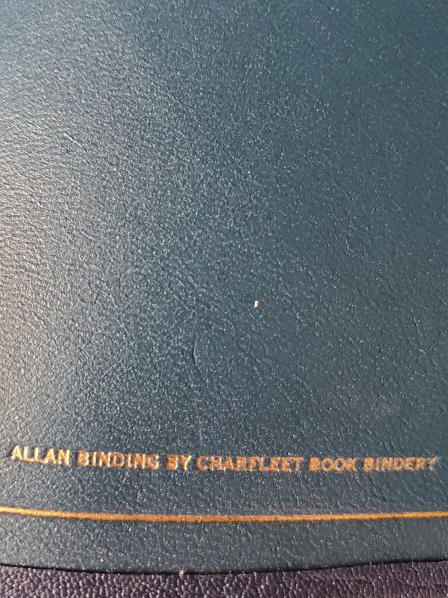
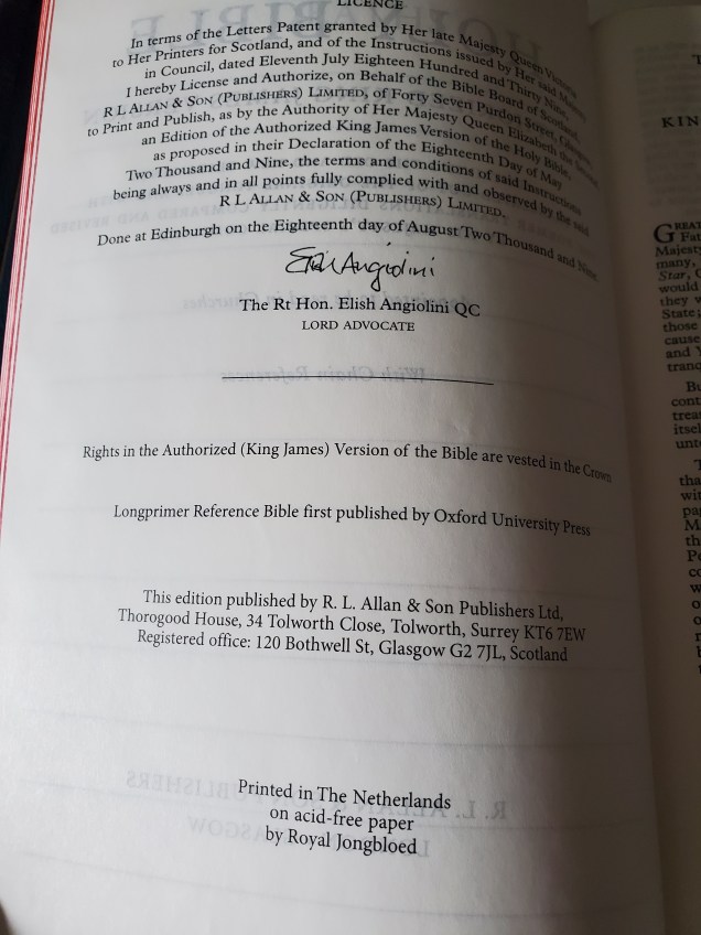
Bound by Charfleet Book Bindery, a business partner of R.L. Allan’s since 2017.
The text block used is the updated one. Bibles-Direct explains:
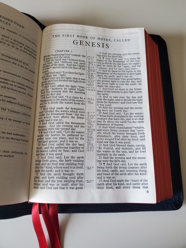
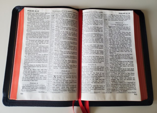
Based on a vintage copy of the classic Longprimer, printed in the period 1952-1958 under Charles Batey, then Printer to the University of Oxford, this Bible returns to a page image that is much closer to the original intentions of the typesetters. This new-old page image retains the large, clear type of the Longprimer we all know and love, but has a crisper letter form and less of the broken type and ‘spread’ that mark out much-used letterpress typesettings subsequently transferred to film and, only more recently, to digital scans
Printed in the Netherlands by Royal Jongbloed, a company I have revered since my first premium bible, the Cambridge wide-margin in NASB. Jongbloed are experts in the printing craft, and the 43 is a “Royal” example indeed:
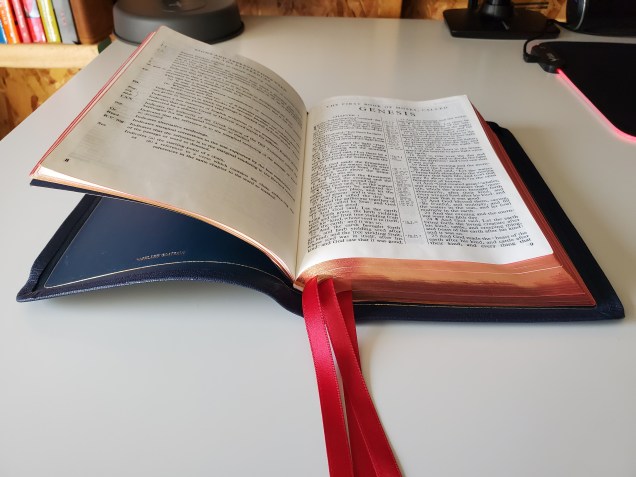
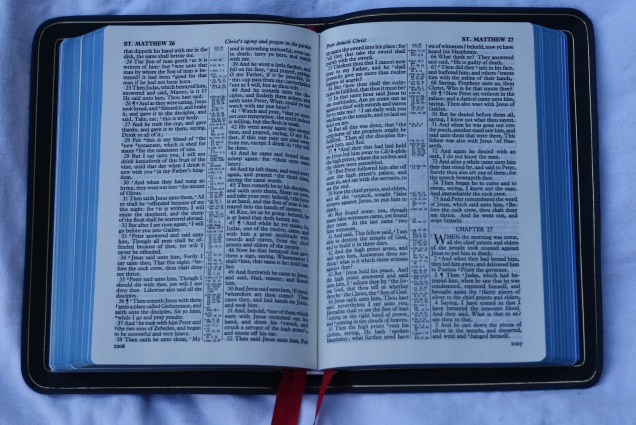
The book does sort of lay flat in Genesis 1, if you push down a bit:
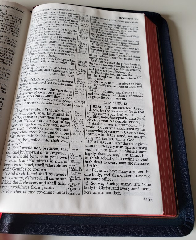
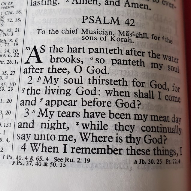
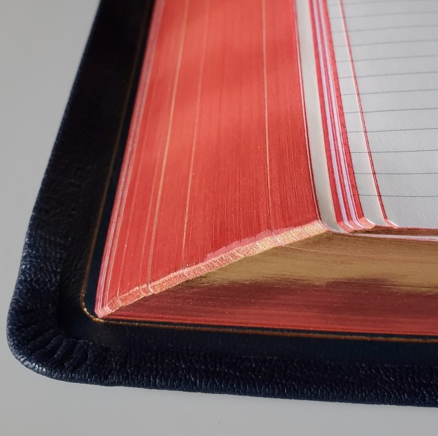
The typeface is clean and legible, and the bleed through is minimal despite the 28 gsm paper:
The 28 gsm paper feels similar to the 36 gsm used in the 53. If I had to guess, it’s the same paper, comprised of the same materials by the same people. It just seems the same quality, despite the difference in gsm:
Up close with natural light:
And closer in case you’re still skeptical:
Up close in the 53 for comparison:
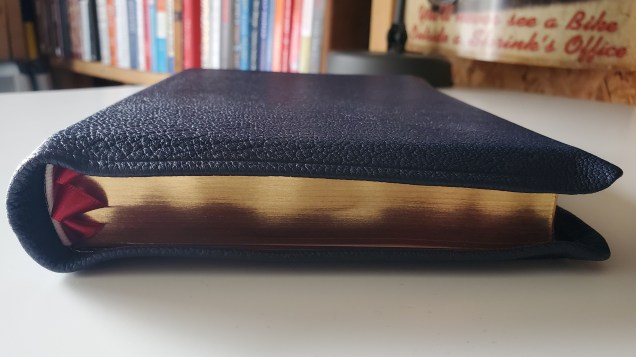
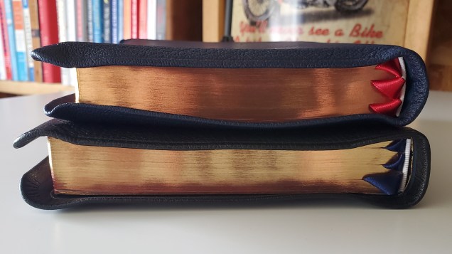
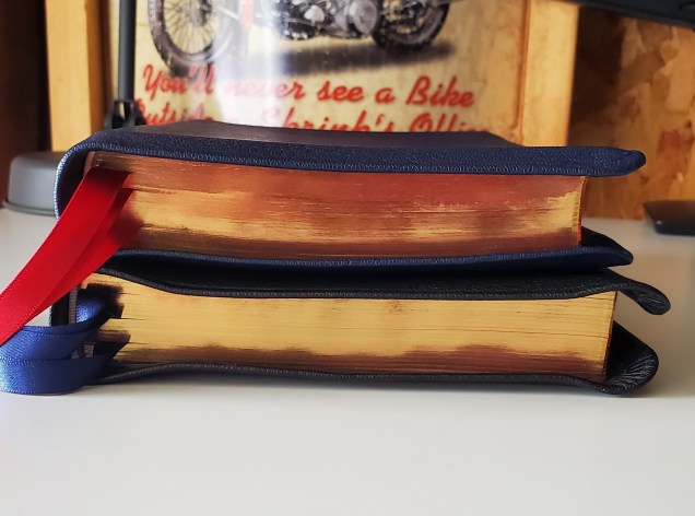
The red under gold page edges are stunning:
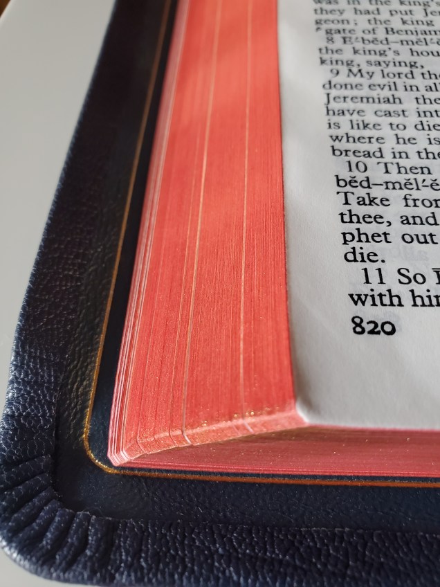
One more of the red under gold art gilt edges:
The 43 appears to have slightly smaller margins:
As compared to the 53: (though the margin discrepancy may be explained by the old typeset used in my old copy of the 53 vs. the new in the 43.)
One more of the 43 open on my desk:
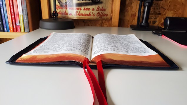
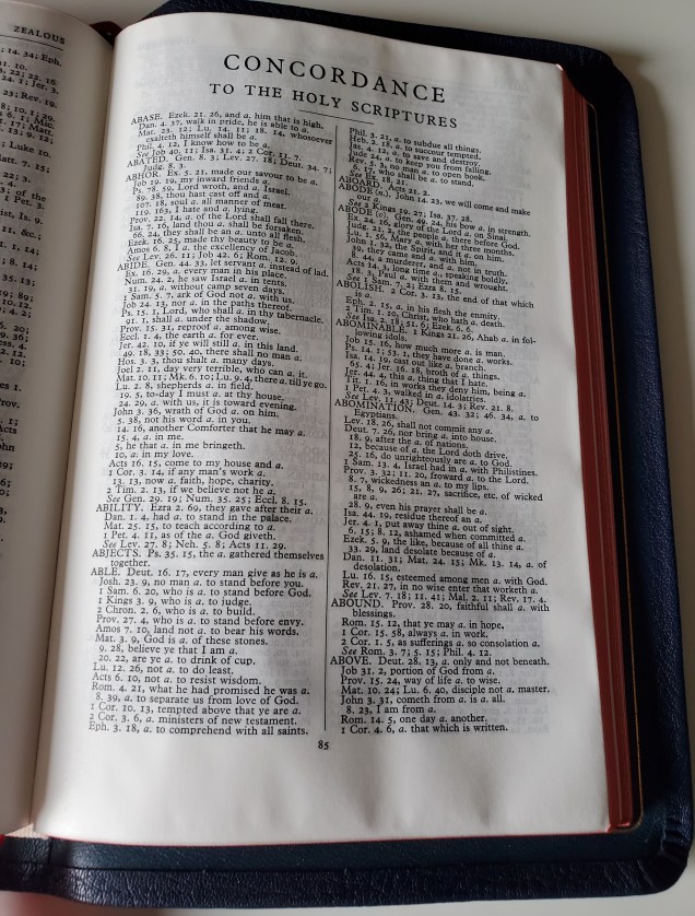
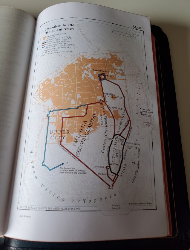
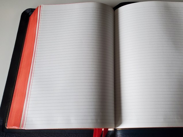
The 43 includes the same bells and whistles as the 53. References, bible maps, a large concordance, index, presentation pages, and lined bible paper come standard:
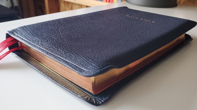
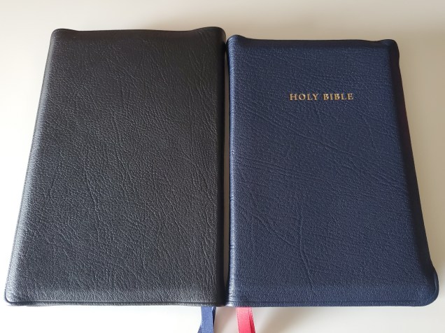
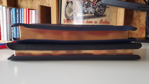
For fun, I’ve included some photos comparing the Allan 43 with the Allan NLT R1. Both of these books were bound by Charfleet. The boxes seem to share the same dimensions at first glance:
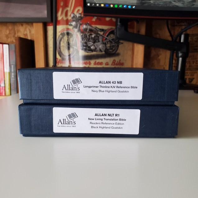
Upon closer inspection the NLT seems a bit taller and perhaps thinner too:
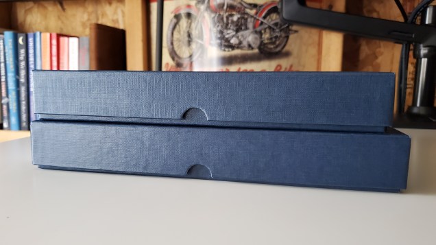
Which is confirmed when the books are placed together:
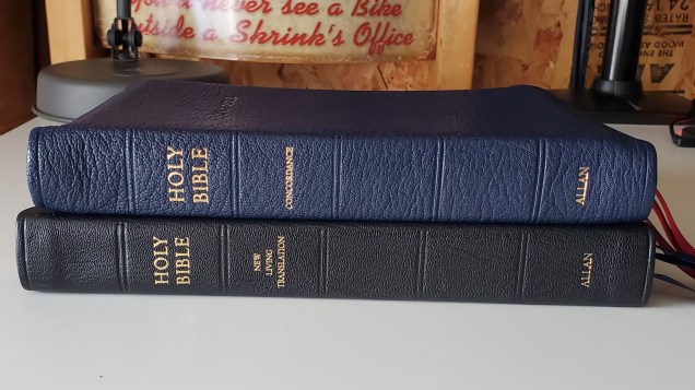
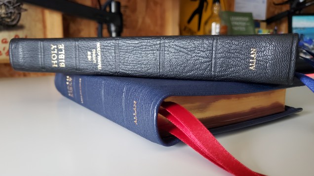
Both books feature a generous yapp, yet the 43’s seems larger:
The black highland goatskin has a lot of grain:
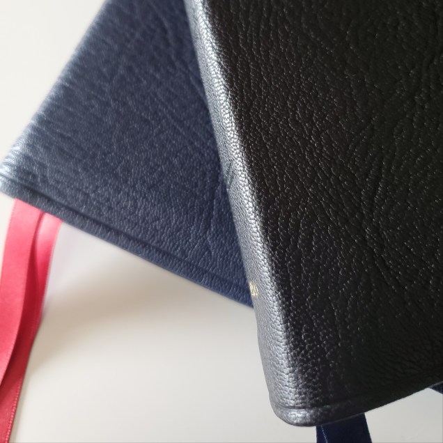
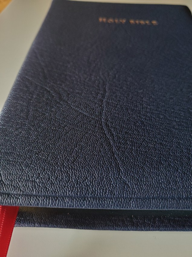
The navy blue highland goatskin on this copy of the 43 is even nicer in my opinion:

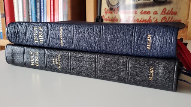
In this photo you can see the NLT is in fact taller:
The 43 is thicker:
In conclusion, the R.L. Allan 43 may be the nicest bible I have ever had the privilege of owning. If you are on the market for a KJV, have a substantial budget, and want something essentially the same as the infamous R.L. Allan 53, but with a slightly smaller dimensions, this book is what you want. If you’re in the market for a 53 and can only find overpriced offerings on Ebay, skip them, and purchase a copy of the 43 directly from Allan or evangelical bible for retail. It really is the same book at the same price. You’re not taking a hit in quality by any means.

Greetings! Just wondering if you still feel the same way about this Bible 9 months later?
LikeLike
Hi Dave, I sold the 43 and ordered the 53. I recommend both books. Just wanted the higher gsm paper for a book that is relegated for desk use.
LikeLike